
EPOS-Norway Portal
USER MANUAL
August 2019
Project Name |
EPOS-Norway |
Project No. |
Research Council of Norway (RCN) Project No. 245763 |
Related WPs |
WP2 |
Document Title |
EPOS-Norway Portal instructions |
Date |
15 August 2019 |
Prepared by |
Amalie S. Erga and Desirée Maloney |
Contact info |
Karen Tellefsen (UiB): Karen.Tellefsen@uib.no |
Document name |
EPOS-N-Portal-User-Manual-2019.pdf |
Related Documents |
EPOS-Norway Portal – User Guidelines |
List of contributors |
Atakan, K., Fonnes, G., Halpaap, F., Lampe, O., Langeland, T., Michalek, J., Rønnevik, C., Tellefsen, K., Utheim, T. |
1. Summary
This User Manual contains information about the general concept of the EPOS-N Portal (Chapters 2, 3 and 4), instructions on how to get started (Chapter 5) and detailed descriptions on use of the portal (Chapter 6). The EPOS-N Portal is a web-based software application for accessing, sorting and doing interactive visual analysis of geophysical and geological data. Easy access to a wide range of data and advanced visual analysis tools makes the EPOS-N portal a suited platform for multidisciplinary research within Solid Earth Science.
The concept of the EPOS-N Portal is based on three basic steps: (i) search/find/select data, (ii) display selected data, and (iii) conduct interactive visual analysis. This three-step concept forms the structure of the main part of the Manual, chapter 4, 5 and 6. Chapter 6; “Using the EPOS-N Portal” covers all of the Portal features and applications and is divided into four sub sections. The “search/find/select” sub-section covers how to start looking for data and explains the different services. Search, find and select, can be repeated to add more data. Furthermore, the “display” sub-section contains information about what the user can do with the selected services and the underlying datasets. After a display is created, the sub-section on “add more data” will be helpful to see how to go back and add more services. When the display is ready, further features are covered by the “analysis” sub-section.
An appendix with selected use cases is added at the end of the document. Use cases provide examples and explain procedures for some of the portal functionalities and possible areas of use. The examples provide a brief overview on how the portal can be used for scientific research. The purpose of this Manual is to explain the EPOS-N Portal use and functionalities, primarily for Solid Earth scientists, but also researchers from other disciplines of Earth Sciences, to utilize it for their own domain-specific or cross-disciplinary research.
2. Introduction – EPOS-N Portal
The European Plate Observing System - Norway (EPOS-N) Portal is a software to visualize, sort and analyse different types of geophysical and geological data. The portal is provided in the context of the EPOS-Norway (EPOS-N) project funded by the Research Council of Norway (RCN, Project No. 245763). Project partners are NORSAR, Geological Survey of Norway (NGU), Norwegian Mapping Authority (NMA), NORCE Norwegian Research Centre AS (NORCE), Department of Geosciences - University of Oslo (UiO) and Department of Earth Science - University of Bergen (UiB). UiB is coordinator of the project. The operational phase of the EPOS-N Project starts in January 2021.
The motivation behind the EPOS-N Portal is to enable seamless access to geological and geophysical data, with the goal of making all relevant geological and geophysical data in Norway accessible through one system. Intention of the EPOS-N Portal is to promote more multidisciplinary research and interaction between scientists from different fields. Tools and data offered through the Portal may simplify research across disciplines of the physical processes that control earthquakes, volcanic eruptions, slope instabilities and associated tsunamis, tectonics and Earth surface dynamics.
This User Manual is explaining how the EPOS-N Portal works and demonstrating its functionalities. The Portal can be used by anyone seeking information about geohazards or georesources, however, the intended users are Earth scientists in general. This manual contains essential information regarding both navigation and use of the EPOS-N Portal. This includes background information, portal functions and step-by-step procedures. When using the EPOS-N Portal, the first step is to search and find the services that are required for the further process. The following steps are to select and display the data for further interactive visual analysis. These steps outline the structure of the User Manual.
EPOS-N Portal is based on Enlighten-web software, a web application developed by NORCE Research. NORCE has IPR (intellectual property rights) on Enlighten-web (+reference to the Technical Report on the EPOS-N Portal (may be included as an Appendix here)). EPOS-N Portal is developed within the framework of the EPOS-Norway project and is based on an open access policy. The Portal is a web-based application that can be accessed by anyone. User authentication is only required if the user wants to upload data to the EPOS-N Server for joint use with the existing datasets in the Portal.
3. Background – EPOS and EPOS-N projects
The European Plate Observing System (EPOS) is a European initiative with the goal of building a pan-European infrastructure for accessing solid Earth science data. The initiative is currently (as of May 2020) in its Sustainability Phase (SP), with the EPOS-SP project funded by the European Commission for three years during the period 2020 – 2022. The EPOS-Norway (EPOS-N) project is the Norwegian node of EPOS and is funded by the Research Council of Norway (RCN) for five years during the period 2016-2020 (Project No. 245763).
The aim of the Norwegian EPOS e-infrastructure is to integrate data from the seismological and geodetic networks, as well as the data from the geological and geophysical data repositories. In line with the EPOS objectives, the main vision of EPOS-Norway is to address the three basic challenges in Earth Sciences:
Unravelling Earth’s deformational processes which are part of the Earth system evolution in time,
Understanding the geohazards and their implications to society, and
Contributing to the safe and sustainable use of georesources.
The goal of EPOS-N is to bring all data that maps the physical conditions of the Earth’s crust under a unified umbrella that;
makes data available and easily accessible to the full geoscience community (and the public),
provides an integration infrastructure that can be used by geoscientists and provide mechanisms for improved use of all available geodata, and
initiates and facilitates closer interaction between scientists from different fields in terms of joint interpretation of different data for the same geographical areas.
4. EPOS-N Portal Concept
The EPOS-N Portal provides the user with search/find/select functionalities, which gives the user access to services. Further, it is possible to display the data, add more data and conduct interactive visual analysis. The concept of the portal is summarized in Figure 4.1 Note that before starting, it is a god idea to create a new project.
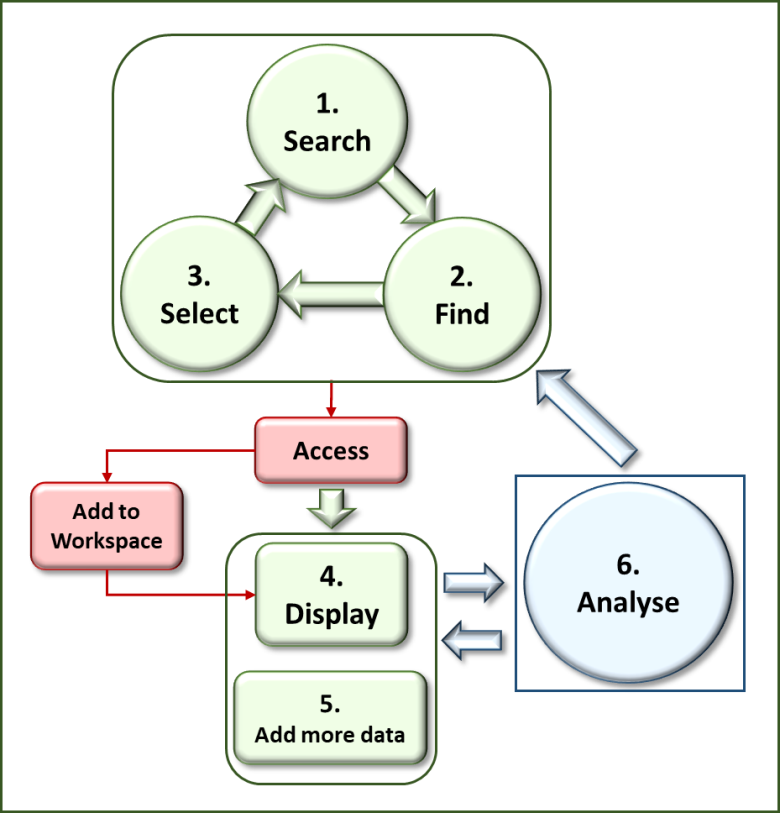
Figure 4.1 Concept of the EPOS-N Portal. Green colour involves the user’s own actions. Red colour implies automatic processes completed by the software. Blue colour requires interactive visual analysis by the user.
4.1. Search
Once the user has entered the portal and created a new project, the first step is to search for services by using the “SEARCH/FIND” button (see chapter 6.1). Service is a broad term that covers data, domain-specific metadata and IT-specific metadata. Data is the actual data the user is interested in accessing, e.g. earthquake locations. Domain-specific metadata is metadata that describes the parameters about the data, e.g. what the depth of an earthquake describes, and the physical unit used for this parameter. IT-specific metadata is metadata that describes the parameters needed for the IT application, e.g. the data type (refer to Appendix within Technical Report?). The “SEARCH/FIND” button provides list of services. During the search process it is possible to choose between different types of categories and services, for example geological or seismological services.
4.2. Find
After searching for services, the user needs to find the services of interest. It is recommended to use the bar charts for filtering on data category and service type, to easily find the required service. When the services have been found, the user may continue selecting the services. More information on this procedure is contained in chapter 6.1.
4.3. Select
When the services of interest have been selected, they can be added to the workspace (left menu). The concept of workspace is to have a place where all the services that the user has an interest in are organized into one place. This function gives the user quick access to the added services. The services added to workspace can be accessed in the “Selected Services” list (workspace). When selecting a service, the content can be found further down under “Selected dataset” (see chapter 6.1for further information).
The Search/Find/Select process can be repeated. The user can search, find and select more services from “SEARCH/FIND”. The system provides access to the selected multidisciplinary data from distributed resources.
4.4. Display
To create different displays, click the “DISPLAY” button. Available displays are map, graph and table display. Graph displays include scatter plot, line plot and bar plot. Select a display type relevant for the data variables and drag the data variable to plot frame. This is explained in detail in chapter 6.2.
4.5. Add more data
After creating various displays, it is possible to go back to the Search/Find/Select process and add more relevant services to workspace. The new selected services appear under the already selected services in the workspace, sorted by type and the order they are added. The display will provide more information after the user adds more data. It is possible to create more displays or open a new display page to add more plots. The user needs to drag the selected data into new plots and analyse jointly. See chapter 6.3 for more information.
4.6. User specific data
Users can also add their own data (currently in CSV format only) or connect to WMS server and compare those with other datasets in the portal. This can be done in pane “Add datasets/services”. The upload functionality is available for authenticated users only. Details are explained in chapters 6.1.3 and 6.1.4.
4.7. Analyse
When using the functionalities of the interactive visual analysis, there are different approaches. The method used in this software to do an interactive visual analysis is called “brushing and linking”. When the same data is plotted both in a map display and a graph display, they automatically link up. Filtering some data in a graph display, also automatically filters the same data in the map display. By using “brushing and linking”, it is therefore possible to find trends in multidimensional parameter space. The user can also download data for further analysis and create more plots with the same or different type of dataset. For more information about data analysis, see chapter 6.4.
5. Getting started
It is recommended to use the Chrome browser for this portal. Firefox and Microsoft Edge do also work but has not been extensively tested yet. It is also recommended to use a mouse to be able to effectively interact (e.g., scroll, rotate, scale) with the visualisations in the portal. Scaling operations in plots depend on a scroll wheel.
To access the portal, use the following link: http://epos-no.geo.uib.no:81/#/view/default. It is also possible to enter the portal by using the link: http://www.epos-no.org/, click on “data & services”, then “EPOS-N Portal”. When entering the portal, the default view with several options appears (Figure 5.1). It is possible to sign in with a Google account to store views between browser sessions. Specify the account information, and a request is sent. When permission is granted, the user will be logged in with the selected Google account. Exiting from the browser or navigating to a different page will not automatically log out the user. The Google account icon can be used to log out.
The Home display contains information about the EPOS-N Portal, including project partners as well as selected information about the portal (Figure 5.1, (1)). The “SEARCH/FIND” option (Figure 5.1, (2)) contains the different types of services that later can be used to make different displays. The “DISPLAY” button provides different display options (Figure 5.1, (3)) and the “+” icon adds a new display page (Figure 5.1, (4)). To the right in default view there is a menu (Figure 5.1, (5)), containing several options which are useful in the display process. In the workspace (Figure 5.1, (6)), the user may create a new project and add content.
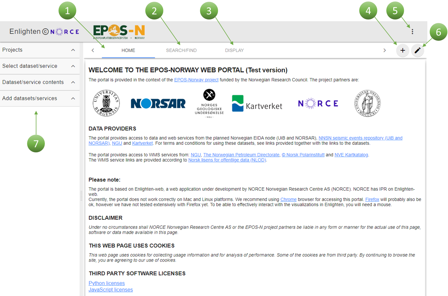
Figure 5.1 Default view “HOME” contains information about the portal (1), “SEARCH/FIND” listing services (2), “DISPLAY” for plot options (3), “+” icon to add a new page (4), main menu with selected operations (5), editing mode on/off (6) and a workspace where one can add content and create a project (7).
6. Using the EPOS-N Portal
6.1. Search/Find/Select
To get started using the portal, the first step is to create a new project (Figure 6.1, (1)) using the “save” button (Figure 6.1, (2)), as it gives the opportunity to save the work that has been done. Enter a new name to the new project (instead of “project”) and click the “save” button. The new name appears in the list of created projects. Remember to save the work regularly.
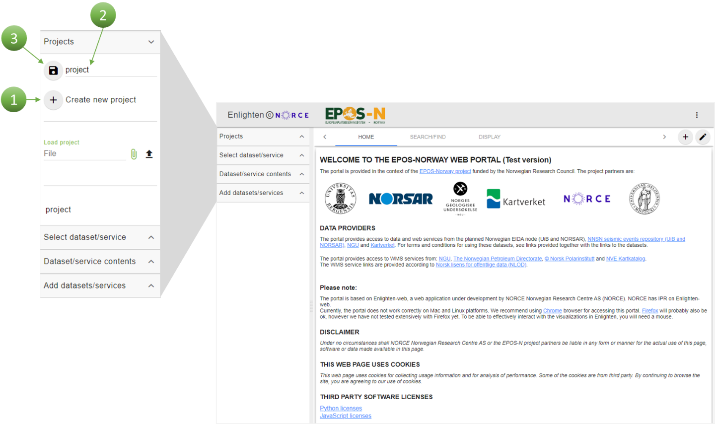
Figure 6.1 Click the “+” icon to create a new project (1), and choose a new name for the project (2). Click the “save” button to save the new project (3).
6.1.1. Search/Find
“SEARCH/FIND” contains all the available data and services that can be used to create different plots. Services is a broad term, and it covers data, domain-specific metadata and IT-specific metadata. Search and find contains a list of services. The services (data, data products, services and software - DDSS) are divided into four categories; geological data, seismological data, geophysical data, and geodesy (Figure 6.2, (1)). In addition to the categories, the services are also divided by service type, as the services have different formats (Figure 6.2, (2)). Map layers are WMS (Web Map Service) files (Open Geospatial Consortium, 2006). CSV files (comma-separated values) are used in contexts when larger amounts of data are to be moved. Seismic events are earthquake data. FDSNWS is an International Federation of Digital Seismograph Networks web service, and is a global standard used in seismology (International Federation of Digital Seismograph Networks, 2019). By clicking on a category or service type, the services belonging to this category will appear under “List of available services” (Figure 6.2, (3)) on the right side.
It is possible to select both a category and a service type in the bar charts to get a systematic view over the services. For example, by clicking “Geological data” and “Map layers”, only the services belonging to both will be available in the table plot. If no category or service types are selected, all services will be available. The bars are coloured blue when unselected and green when selected. To unselect a category or service type, simply click the selected bar again.
Most of the services can be added to workspace by clicking “ADD” (Figure 6.2, (4)). Workspace is the place where all the added services are organized. This gives the user quick access to the added services. Both for waveform data and INTAROS (EU-Project: Integrated Arctic Observation System) data, earthquake parameters can be selected within a specific period of time and coordinates. Waveform data are data from seismograms registered at seismic stations, which include P- and S-waves of earthquakes. The data in “INTAROS project” are a compilation of the processed earthquake source parameters for the Arctic region. There is an “INFO” button available for each service (Figure 6.2, (5)), providing information about the current service. Some services are external and available through links (Figure 6.2, (6)). In order to gain access to these services, click the “LINK” button, which will redirect the user to a new webpage. It is also possible to select a customised seismological dataset by clicking the “ADD…” button (Figure 6.2, (7)).

Figure 6.2 Services are divided by categories (1) and service type (2). “List of available services” is on the right side (3). By clicking “ADD”, the service is added to workspace (4). “INFO” provides information about the selected service (5). The “LINK” button redirects the user to a webpage with external information (6). It is also possible to select a customised seismological dataset by clicking the “ADD…” button (7).
6.1.2. Select
When the services of interest have been selected, they can be added to workspace by clicking “ADD”. All added services are organized in the workspace, providing quick access for the user. The workspace consists of “Select dataset/service” (Figure 6.3, (1)) where one can select the added datasets/services for further operations, “Dataset/service contents” (2) to further explore the added datasets/services, and “Add datasets/services” (3) where it is possible to enter a WMS URL to add external services or load user specific data. Each added service contains different types of data.

Figure 6.3 After selecting datasets or services, more operations may be done from the workspace menu. The added datasets or services will appear under “Select dataset/service” (1). The content of a dataset or service is shown under “Dataset/service contents” (2). It is also possible to add external datasets or services (3), by entering a WMS url or uploading user specific data.
To add a service, click ”ADD” next to the service (Figure 6.4). The added service appears in the workspace under “Selected services”. It is possible to select more services if desired. When the service appears in the workspace, the symbol varies depending on the type of service that has been selected. It is either a table symbol or a layer symbol. The table symbol represents a dataset with metadata (e.g. CSV files), and the layer symbol represents a WMS service type (map layers). The first service selected in Figure 6.4 is “NORSAR/UiB stations - array”, and has a table symbol and is a FDSNWS-stations type. The second service, “Bedrock geology maps”, has a layer symbol and consists of layers to add to the globe map. Map layers cannot be added to graph or table displays.
Click on the added service to choose between different data in the dataset menu. In a dataset there are different types of formats that describe the data (Figure 6.5). The column names explain what the data represents, e.g. latitude and longitude. The type “int64” is an integer and denotes a number without fraction component, whereas “float64” contains decimal numbers with fraction component. For map layers the layer names appear under dataset Figure 6.6).
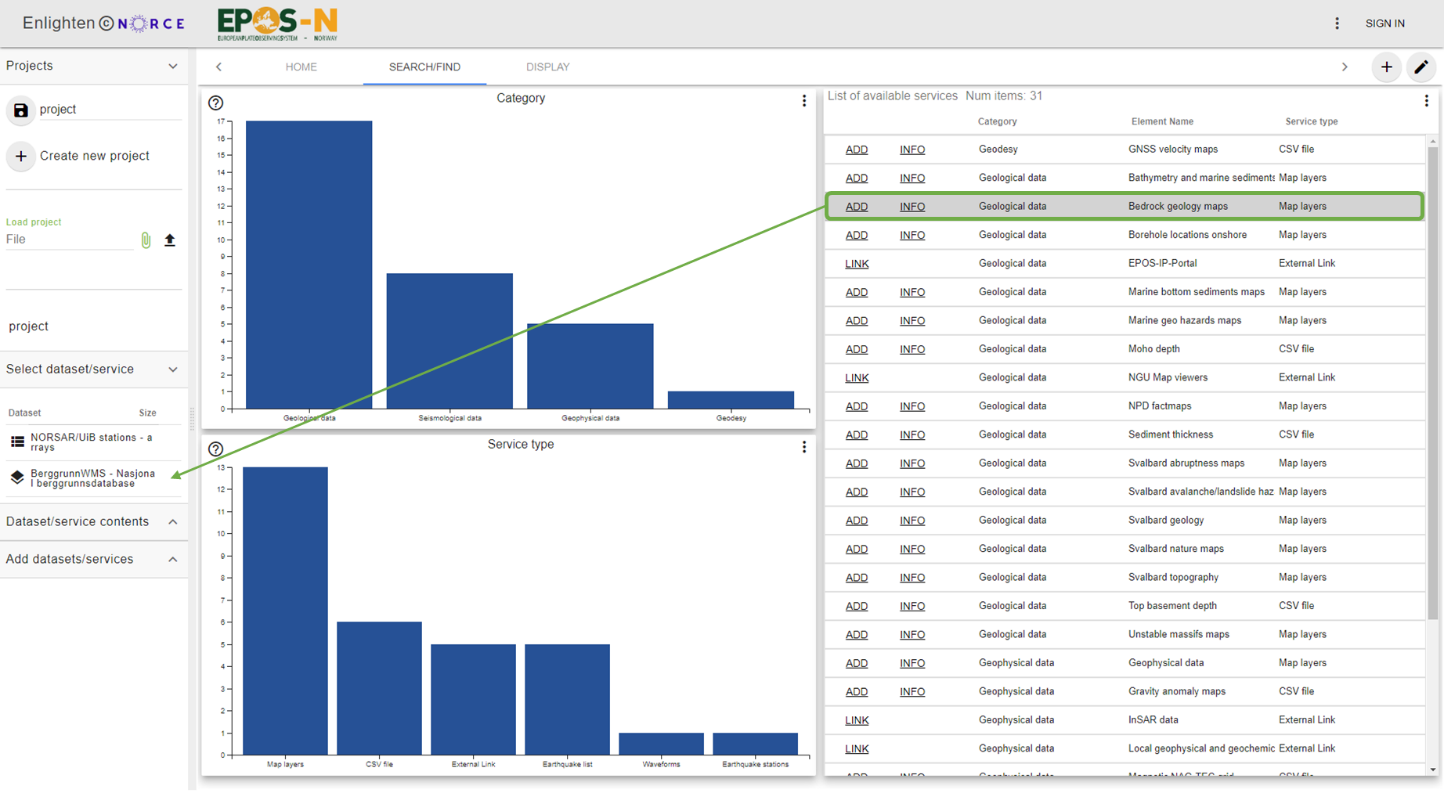
Figure 6.4 To add a service, click “ADD” and the service will be available in “Selected services”.
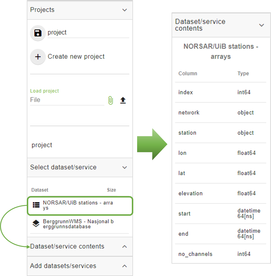
Figure 6.5 Click on a service provides access to the data available in the dataset under the “Dataset/service contents” banner.
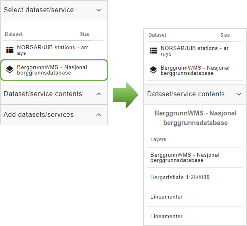
Figure 6.6 To get access to all the data from a map layers, simply click on the desired WMS layer.
6.1.3. External WMS
It is also possible to add an external service to the workspace (Figure 6.7. An example how to find an URL is to visit NGU’s webpage and click “API AND WMS SERVICES” (can be accessed through NGU’s “LINK” in “List of available services”). Find a url in the website and copy and paste it into “Enter WMS url” in the workspace. To import the service, click the “+” icon, and the service will appear under “Selected services” while the data belonging to the service appears under “Dataset”.
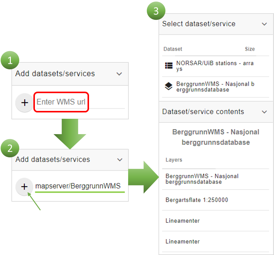
Figure 6.7 Enter a WMS URL (1) and click the “+” icon (2). The imported service will appear
under “Select dataset/service” and the data appears under “Dataset/service contents” (3).
6.1.4. Upload user specific data
User can upload its own data to the portal for comparison and analysis with other datasets. This feature is available for authenticated users only.
To DO: Describe authentication procedure: Whom to contact, privacy policy, quota for user data, etc.
Expand “Add datasets/services” in the left menu (Figure 6.8, (1)). Click the “+” button next to “Load your own data” label and upload your file in the new dialog box (Figure 6.8, (2)). The field “Name” is for naming your dataset in the workspace. Once confirmed, new dialog box is opened and user can specify “CSV parameters” in JSON format by following manual of pandas. read_csv library (e.g. delimiter can be specified here, number of skipped lines, format of date and time, etc.) (Figure 6.8, (3)). Currently only text file format is supported. After application of CSV parameters the dataset will appear in the workspace (Figure 6.8, (4)). If the input file is parsed successfully the pencil icon next to its name is green. The CSV parameters can be modified by clicking the pencil icon.
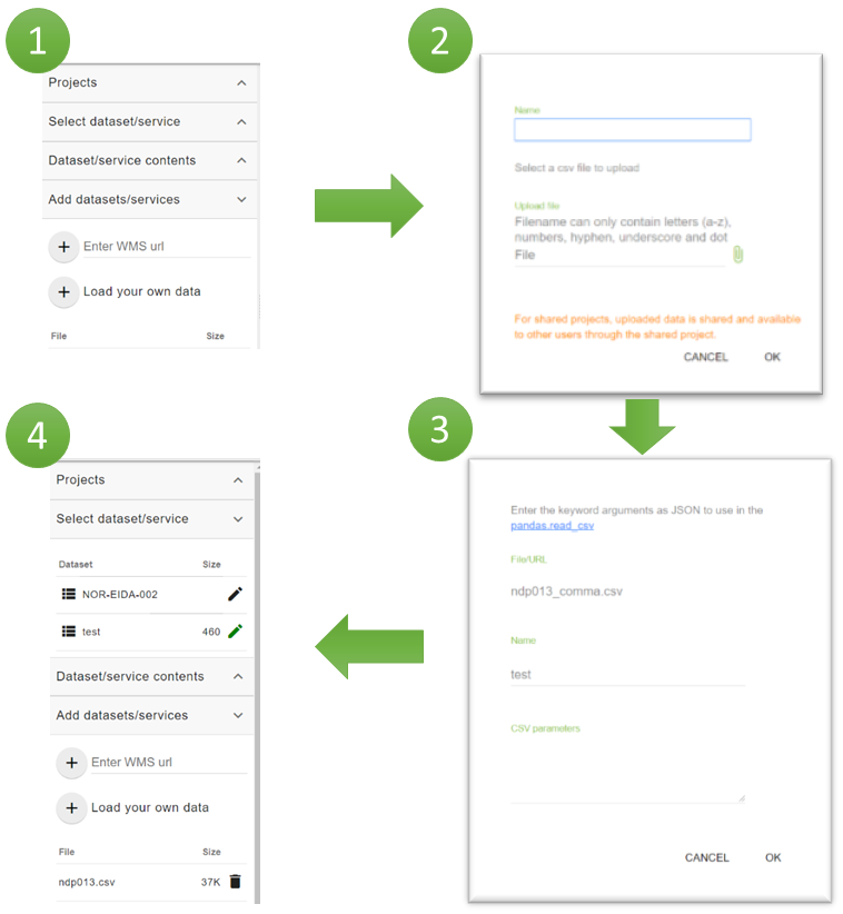
Figure 6.8 User can add WMS layers and data in text file format (1). Upload and name your data (2) and specify parameters for import (3). Once done, data will appear in list of selected datasets (4).
6.2. Display
The EPOS-N Portal provides different displays that can be accessed
through the display bar. To create a display, data must be dragged into
the wanted plot frame. To add a new display page, click “Display” in the
top toolbar (Figure 5.1, (3)), or click the “+” icon Figure 5.1,
(4)). The user can choose between map, graph or table display (fig6.9).
Graph display includes scatter plot, line plot and bar plot.
6.2.1. Toolbar
The toolbar provides options to use and change common functions. The layout for a new display can be modified by clicking “Change Layout” (Figure 6.10, (1)). A dataset may not contain values for all the columns at all timestamps. The option “Forward fill holes in series for plots” can then be useful (Figure 6.10, (2)). If this function is turned on, missing values will be set equal to the last existing value preceding the missing values. A maximum of five missing values will be replaced. When using the “brushing and linking” feature (Chapter 6.4), the user can choose if points outside the selection should be shown (Figure 6.10, (3)). In the default view, the function is on and all points outside of the selection is shown in grey scale. If the function is off, points outside the selection are hidden. This option is relevant when the user wishes to filter the data. If needed, all the filters applied in the plots in the current display can be removed by clicking “Clear all filters” (Figure 6.10, (4)). The font size can also be edited depending on the user’s needs (Figure 6.10, (5)). It can be adjusted up/down for axis texts for all plots in the project. The final option in the toolbar is to open the EPOS-N Portal User Manual (this document), for assistance (Figure 6.10, (6)).
.._fig6.9:
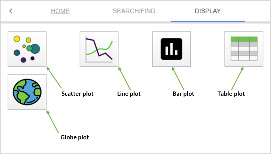
Figure 6.9 The different symbols represent the different plot types available for displaying the data on the display page.
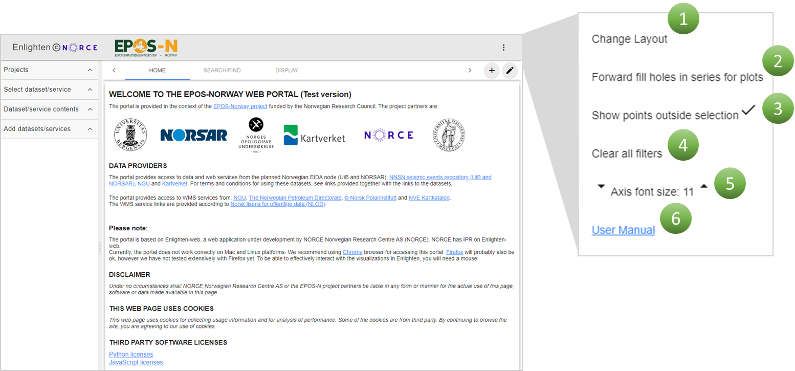
Figure 6.10 The toolbar in the upper right corner contains (1) “Change layout” to set the number of columns and tiles on current display, (2) to turn on/off forward filling of the holes, (3) to turn off/on points outside the selection, (4) to clear all filters applied in plots, (5) to adjust font size in plots, and (6) a link to the User Manual.
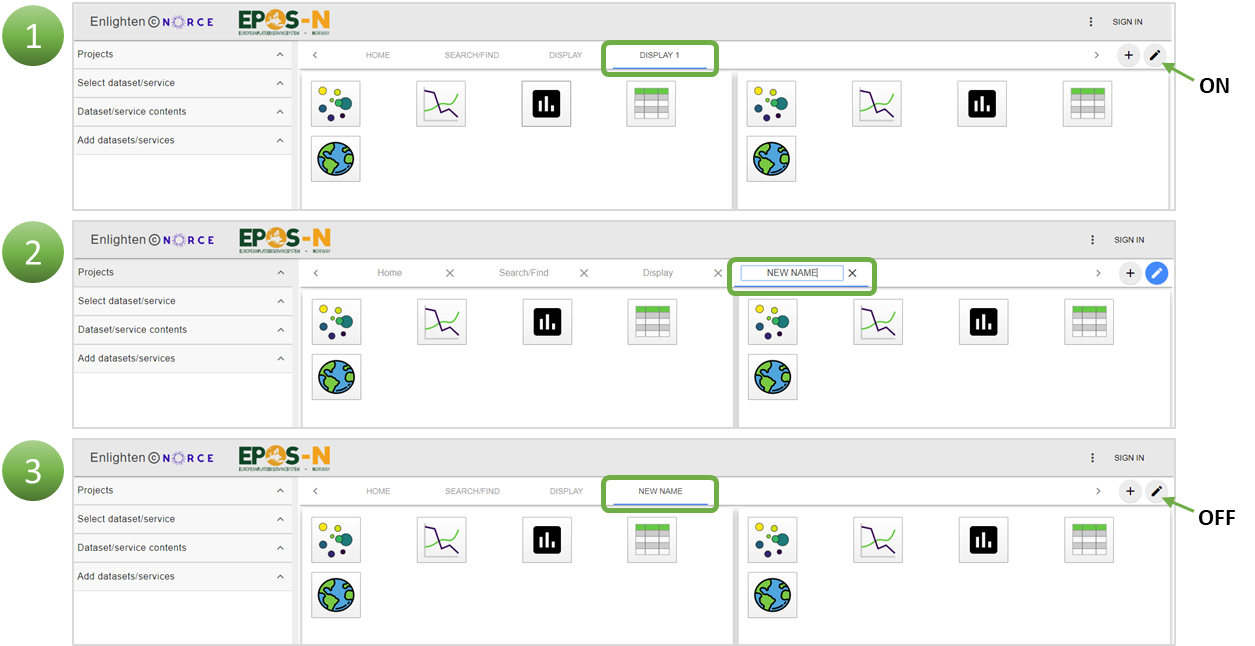
Figure 6.11 To edit the default page name, enable edit mode by clicking the pencil (1), then type in the new name (2) and finish by switching off the edit mode (3).
6.2.2. Scatter plot and Line plot
6.2.2.1. How to create a scatter plot
The default view shows an empty plot with X- and Y-axis and a toolbar. When creating a scatter- or line plot, drag the wanted data column to the panels, either X-axis, Y-axis, colour or size (Figure 6.12). Data column can also simply be added by dragging the desired data into the plot directly, without aiming for a panel. If this approach is used, the data will automatically be placed at X-axis first, Y-axis second, and then colour and size. Note that if adding the wrong data or putting it in the wrong panel, it can be deleted by clicking plot content and the “X” next to the panel (Figure 6.13).
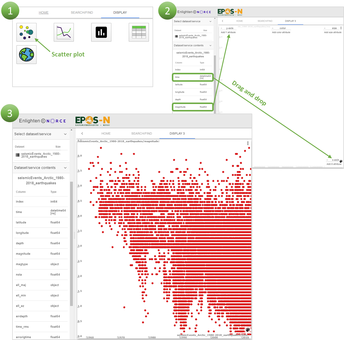
Figure 6.12 In order to create a scatter plot, select scatter plot in the DISPLAY menu (1), drag the wanted data into the plot frame and place them in the correct panels for the X and Y axes, respectively (2). The plot will be generated automatically (3).

Figure 6.13 To delete the data added to a panel, click on “Plot contents” in the plot toolbar (1) and then click on the X next to the data (2). The data will then be deleted.
6.2.2.2. Toolbar – Scatter plot and Line plot
When a scatter- or line plot is chosen, the toolbar contains four options; By clicking “Remove plot”, the user can delete data that is added to the display, making it possible to start over or choose a different plot option (Figure 6.14, (1)). The “Maximize” option shows up when data is added to the frame and centralizes the data, fitting the window accordingly (Figure 6.14, (2)). The Y-axis normally increases upwards, but with “Flip Y-axis” the user can switch the Y-values to increase downwards (Figure 6.14, (3)). “Plot contents” is used when adding or deleting data to/from the X-axis, Y-axis, colour and size (Figure 6.14, (4)).
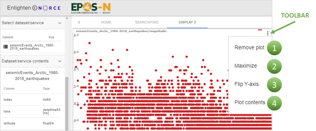
Figure 6.14 The plot toolbar has several options: click “Remove plot” to go back to the new page display (1), and Maximize to fit the data to the screen view (2), “Flip Y-axis” to change the values on the axis (3) and “Plot contents” to add/delete data to/from the X-axis, Y-axis, colour and size (3).
6.2.3. Bar plot
6.2.3.1. How to create a bar plot
It is possible to make a bar plot for some of the datasets. Only datasets with the “object” data type can currently be used to create bar plots. The “object” data in this portal is mostly text values. The bar plot can show how often some values are used. To create a bar plot, an “object” data type needs to be dragged into frame (Figure 6.15). It is only possible to place data to the X-axis panel.
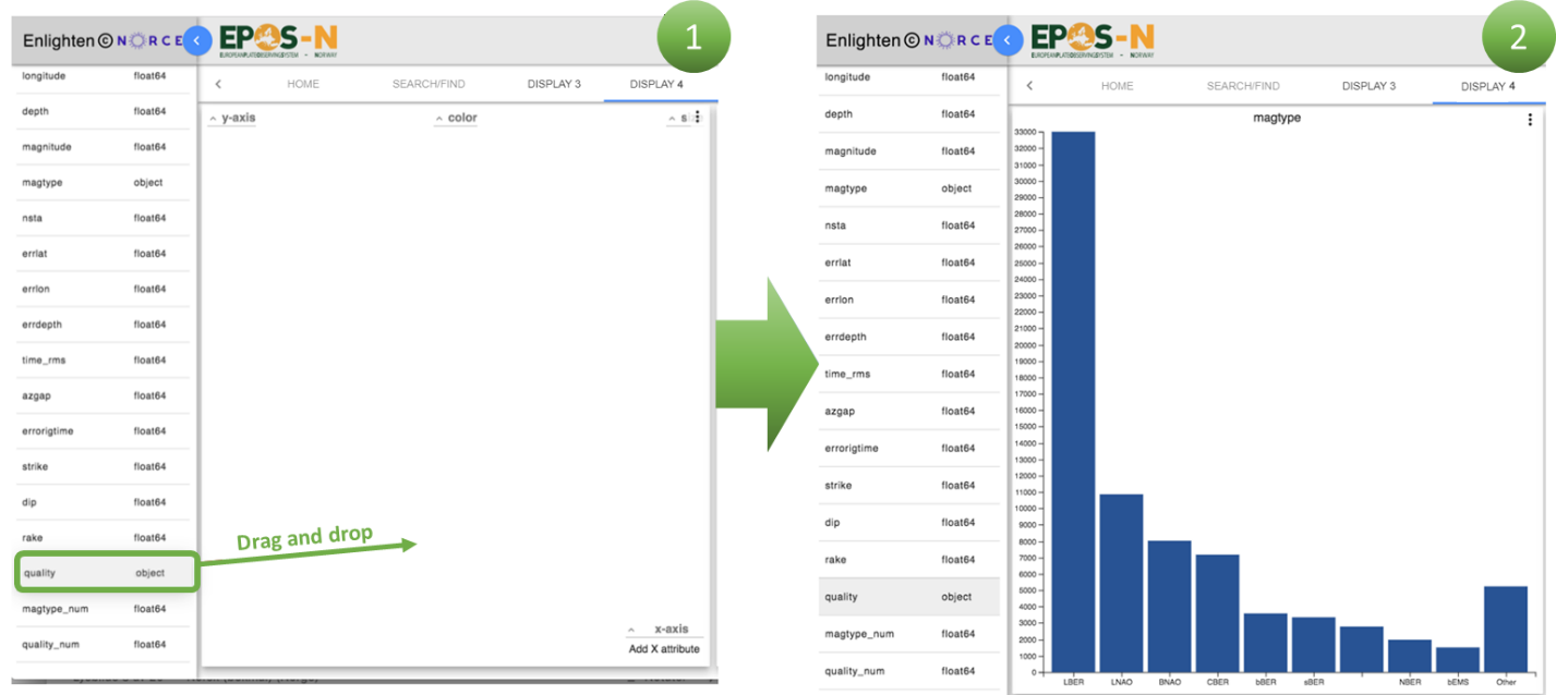
Figure 6.15 To create a bar plot, select the bar plot, and drag and drop the wanted data into the plot frame.
6.2.3.2. Toolbar – Bar plot
When a bar plot is selected, the only option in the toolbar is to remove the plot that has been made. “Remove plot” takes the user back to the new page display.
6.2.4. Table plot
6.2.4.1. How to create a table plot
To create a table plot, the user has to drag the entire dataset into the frame. In this plot, the complete dataset is displayed, not just the data that is used to create a scatter plot (Figure 6.16).
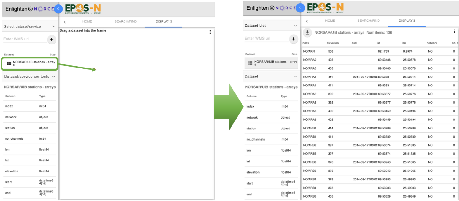
Figure 6.16 Select the table plot and drag the wanted dataset into frame to get access to all the data in a table plot.
6.2.4.2. Toolbar – Table plot
The table plot toolbar gives the option to “Remove plot”, and it is therefore possible to start over or choose a different plot option (Figure 6.17, (1)). The “Forward fill holes in series” option can be turned on/off. If this function is turned on, missing values will be set equal to the last existing value preceding the missing values. A maximum of five missing values will be replaced. (Figure 6.17, (2)).
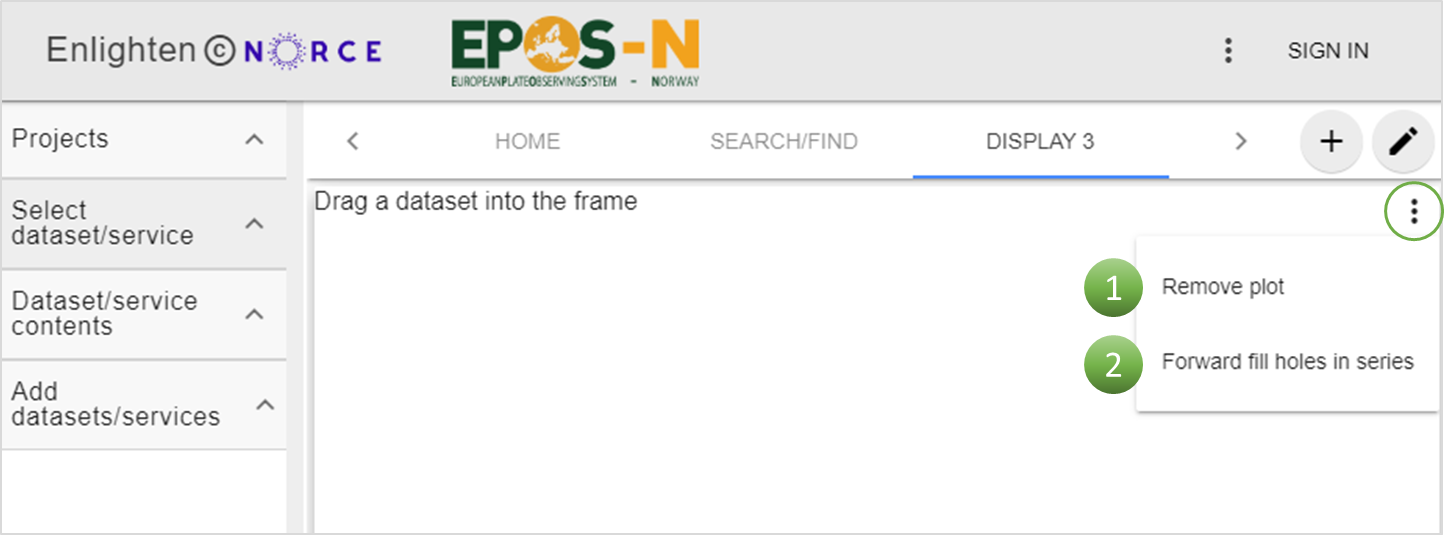
Figure 6.17 Toolbar to table plot, where it is possible to “Remove plot” (1) and to “Forward fill holes in series” (2).
6.2.5. Globe
6.2.5.1. How to create a globe display
By clicking on the globe icon, a globe display appears. To create a globe plot, the same method as for scatter and line plot is used. Drag the wanted data into panels, either X-axis, Y-axis, colour or size (Figure 6.18). For globe plots, map layers can also be added. Data can also simply be added by dragging the wanted data into the plot directly, without aiming for a panel. If this approach is used, the data will automatically be placed at the X-axis panel first, Y-axis second, and then colour and size. Note that if adding the wrong data or putting it in the wrong panel, it can be deleted by clicking “Plot content” and the “X” next to panel (Figure 6.13).
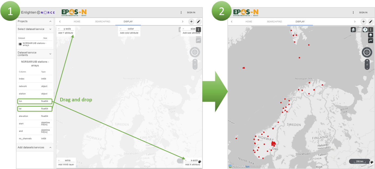
Figure 6.18 Drag data into frame and place them in the correct panel (1), and a globe plot with data will be generated (2).
6.2.5.2. Options and toolbar for globe display
The view home option takes the user back to default view (Figure 6.19, (1)). The centre of the map is dependent on which data have been used (Figure 6.19, (2)). The icon of a projection globe selects map projection, with options to change the view to 2D or Columbus (Figure 6.19, (3)). 3D is the default view and provides the best visualisation. Columbus view is a tilted version of the 2D view where the points with non-zero height are plotted above surface of the map. The map icon is an open street map that can be used to change imagery and terrain (Figure 6.19, (4)). To learn how to move around and navigate the map, a navigation instruction is available Figure 6.19, (5)). The navigation tool can be used to move around instead of a mouse (Figure 6.19, (9)) and zoom in or out by using the “+” or “-” icon (Figure 6.19, (10)).
The toolbar gives the option to “Remove plot”, “Vector plot” and “Plot contents” (Figure 6.19, (6)). “Remove plot” takes the user back to the new page display. “Vector plot” makes it possible to plot one-, two- and three-dimensional vectors along the X-, Y-, and Z-directions. Plotting vectors gives the user more information on data that has a location and a direction. The arrow directions are decided from the X, Y and Z values, and at the moment only GNSS (Global Navigation Satellite Systems) velocities can be plotted as vectors. It is possible to turn vector plot on/off (Figure 6.20). The “Plot contents” option is used when adding/deleting data to/from any dimension, such as the X-axis, Y-axis, colour and size. The added map layers can easily be turned on/off by checking off the box belonging to the layer (Figure 6.19, (7)). It is also possible to adjust the transparency of the layers by adjusting the slider. The layers can also be sorted by clicking on the arrows for best results. PLOT TYPE draws a line between points in the map, which is useful if the points represent a path.
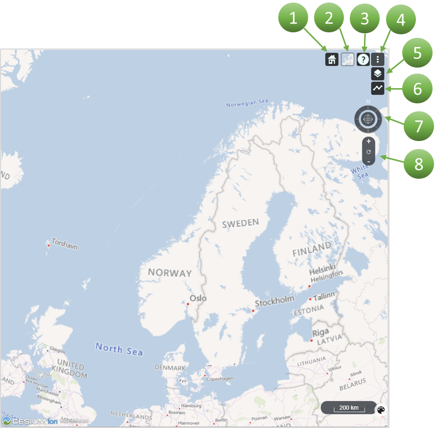
Figure 6.19 The globe display shows a number of options in the top right corner of the view. The ‘view home’ option centralises the map view (1). It is possible to display different open street map layers (2). To view a guide on how to navigate the map, use the navigation instruction button (3). The toolbar provides the options “Remove plot”, “Vector plot” and “Plot contents” (4). To turn on/off WMS layers, click on the symbol for WMS layers (5), Plot type: ?(6). You can navigate the map by using your mouse or by using the ‘compass symbol’ (7). To zoom in/out, use the “+” or “-” buttons (8).

Figure 6.20 In order to plot vectors, open a globe plot, click on the plot toolbar and select “Vector plot” (1). Drag data into the vector-x, vector-y and vector-z panels (2). In this example GNSS velocities will appear in the plot as arrows (3).
6.3. Add more data
6.3.1. Workspace
After plotting data, the user can repeat the search/find/select process. This is done by clicking “SEARCH/FIND” again and selecting new services of interest. The recently selected services appear in the workspace and can be added to a new or already existing display. Services in the workspace are sorted by the order in which they were added and whether they are datasets or map layers.
6.3.2. Display
After a plot has been created, it is possible to add more data to the display to get more information. This can be done by adding more tiles/columns to see different plots at the same time, or by adding more data to the existing plot. Another option is to open a new display page to add more plots. Only plots in one display are linked together for using the “brushing and linking” feature.
The default for a new display page is two tiles and two columns, but it is possible to create more tiles and columns to see more plots at the same time (Figure 6.21). This can be used to add data from a dataset into different plots. The approach is to drag the selected data into new plots and to analyse them jointly. By doing so, the user gets more information about the dataset.
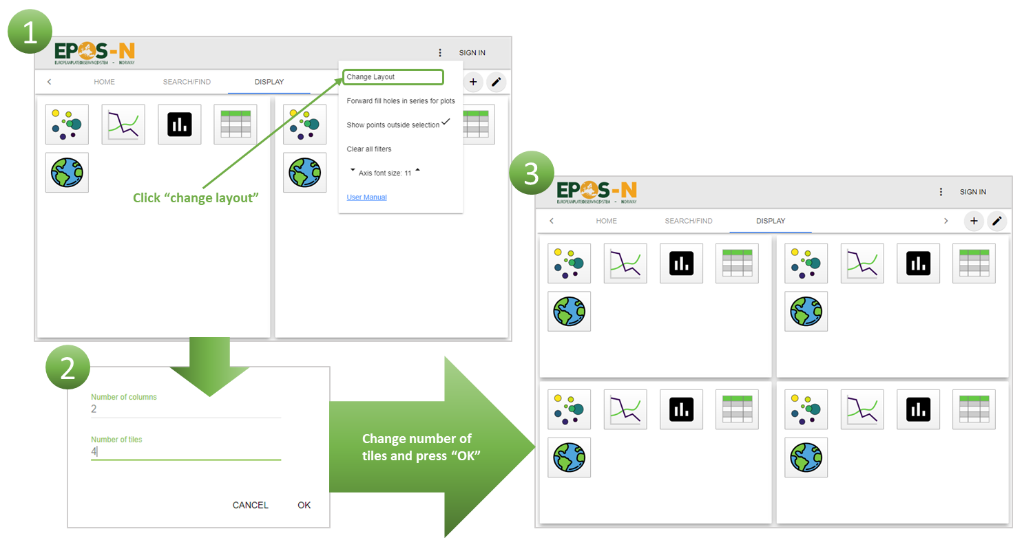
Figure 6.21 Click “Change Layout” (1) and then select the desired number of columns and tiles (2). An example with a layout with 2 columns and 4 tiles is illustrated in the figure (3).
By adding more data from another dataset to an already existing plot, it is possible to get more information from the same plot. The data added from different datasets will have different colours, unless colour attributes have been added. When colour attributes have been added, the data may have similar colour codes. If this makes it hard to separate data from the different datasets, the colour code can be adjusted for one of the datasets. To adjust the colour code, start by clicking the “colour palette” icon, then click on the colour grading and select a different colour map (Figure 6.22). Note that when adding map layers, the colour palette works as a legend and legend items loaded from WMS server cannot be modified.
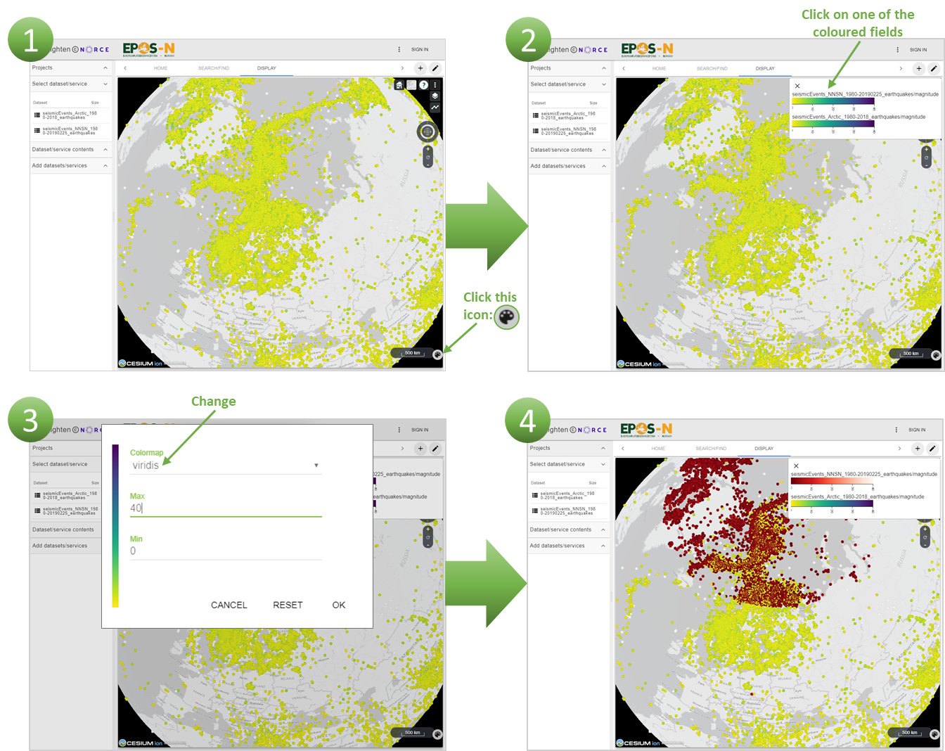
Figure 6.22 When clicking the “colour palette” icon (1), a “pop up” with a colour grading for each dataset will show. Selecting the colour grading for the wanted dataset (2) makes it possible to change the colour map as well as the max and min values (3). By selecting two different colour maps, it is possible to separate data from two different datasets in a plot.
6.4. Analysis
When analysing the data, there are several possible approaches. One method is an interactive visual analysis called “brushing and linking”. In map view, Alt + left mouse button allows you to draw a filter box and the left mouse button can move it while clicking inside the box. In all plots except maps, Shift + left mouse button can be used instead. To use “brushing and linking”, data from the same dataset must be plotted in two different plots, e.g. a map plot and a graph plot, or in two graph plots. Selecting data in a graph plot will result in the chosen data being highlighted in the map plot (Figure 6.23). Using this method makes it possible to find trends in multidimensional parameter space and to visually correlate trends in different parameters.
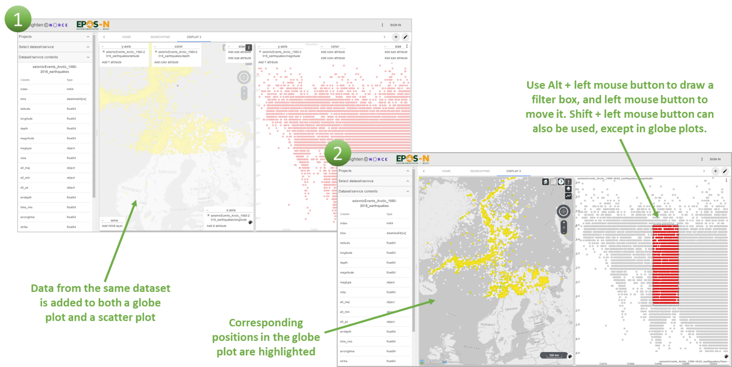
Figure 6.23 Brushing and linking is done by holding “Alt” on keyboard + left mouse button and then marking an area.
It is possible to create more plots (see Chapter 6.3) and link them up to further analyse the data (Figure 6.24). When using brushing and linking, only the marked area is displayed in the other plots containing data from the same dataset. When working with different plots, it is possible to add filter to each of them. If wanted, all the filters applied in plots can be removed by clicking “clear all filters” (located in main options). When using the “brushing and linking” method, a new function appears in plot options. The function is “Edit filter” and allows to modify border values for the filter (Figure 6.25).
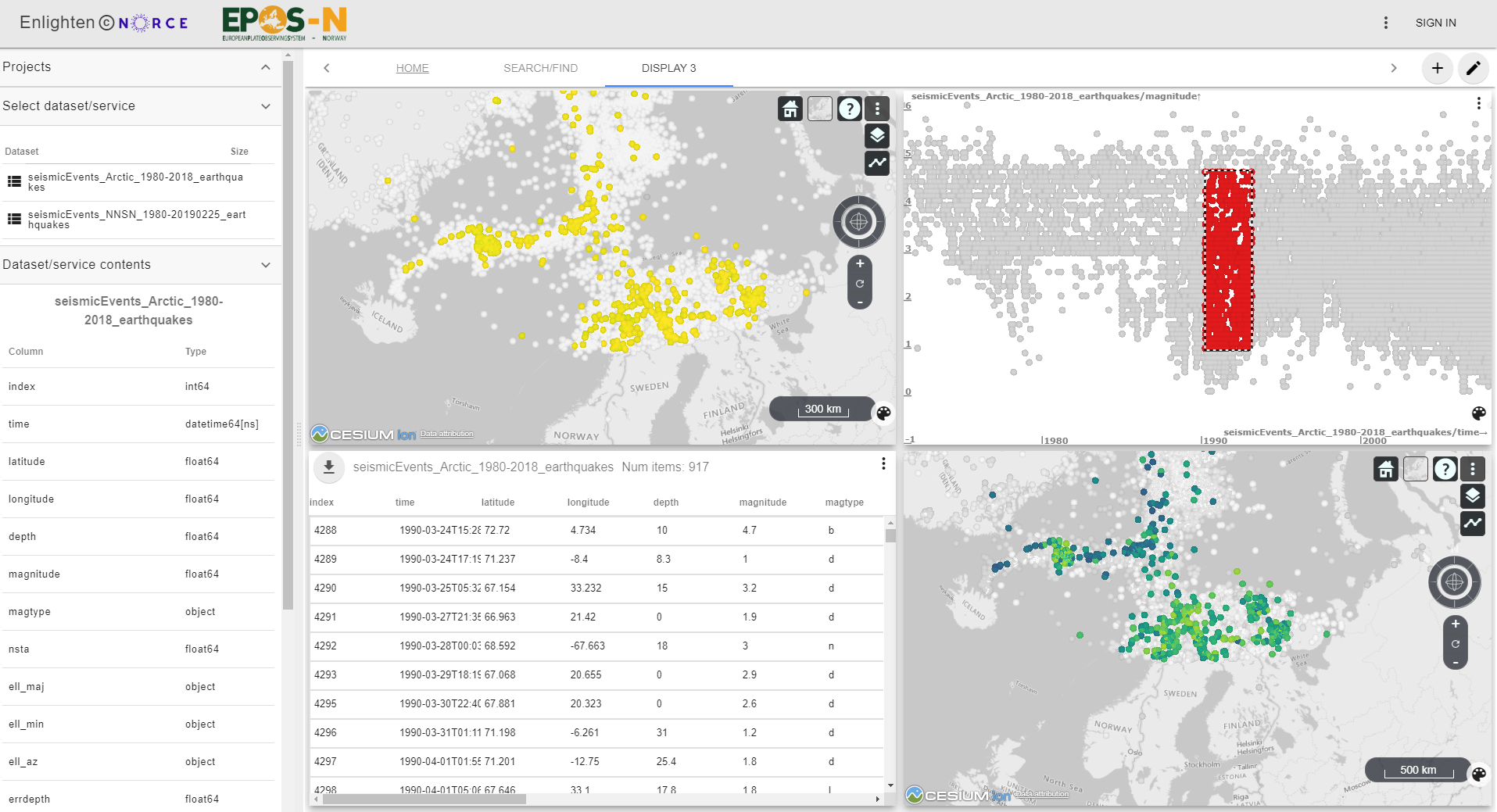
Figure 6.24 By adding more plots with data from the same dataset, they will link up by using brushing and linking.
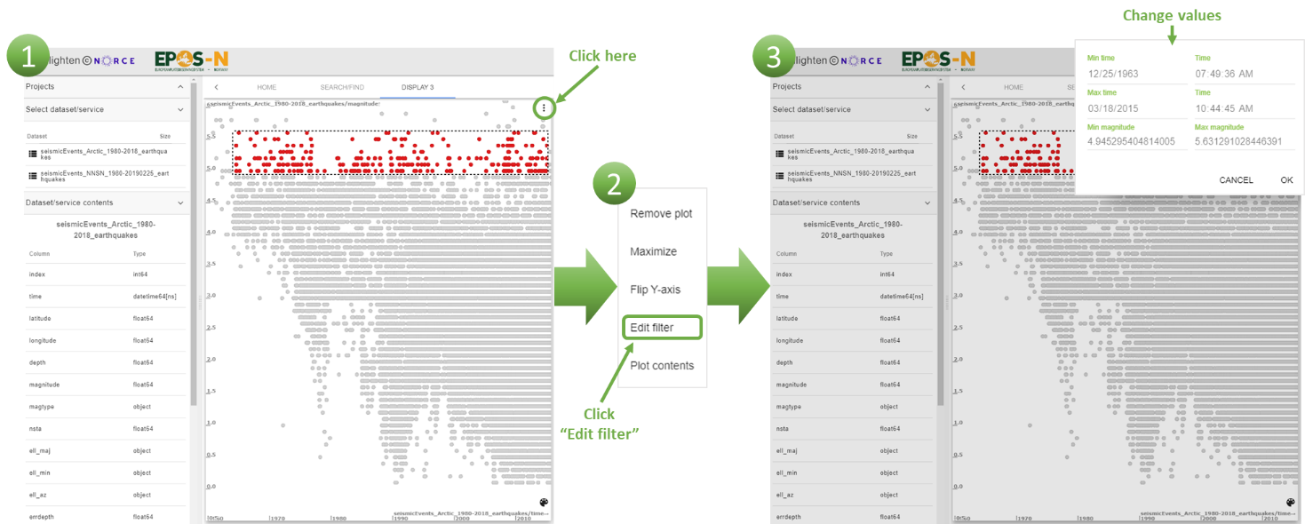
Figure 6.25 To edit a filter click the toolbar (1), choose “Edit filter” (2) and change the values (3).
When using the brushing and linking function, the user can choose whether points outside the selection are displayed or not. The function can be turned on/off by clicking “Show points outside selection” in the toolbar. When the function is on, the points outside of the selection are displayed in grey colour. If the function is off, points outside of the selection are hidden (Figure 6.26).
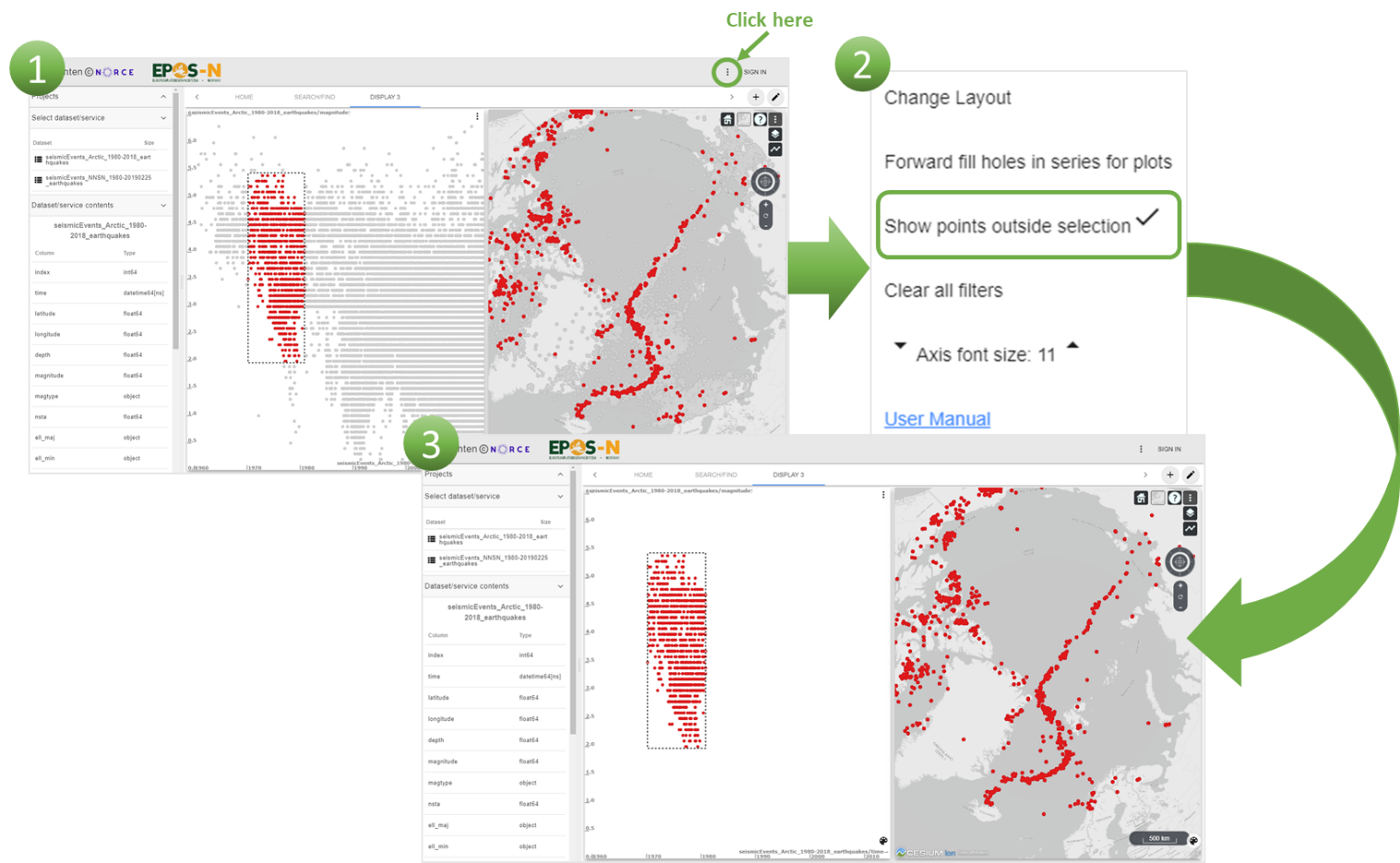
To hide the points outside the selection when brushing and linking (1), click “Show points outside selection” to turn this function off (2). The points previously shown in grey are now removed (3).
If a table plot has been created, it is possible to download the dataset for further analysis (Figure 6.27). For example, if a waveform dataset or an INTAROS-earthquake dataset is selected, it can be downloaded.
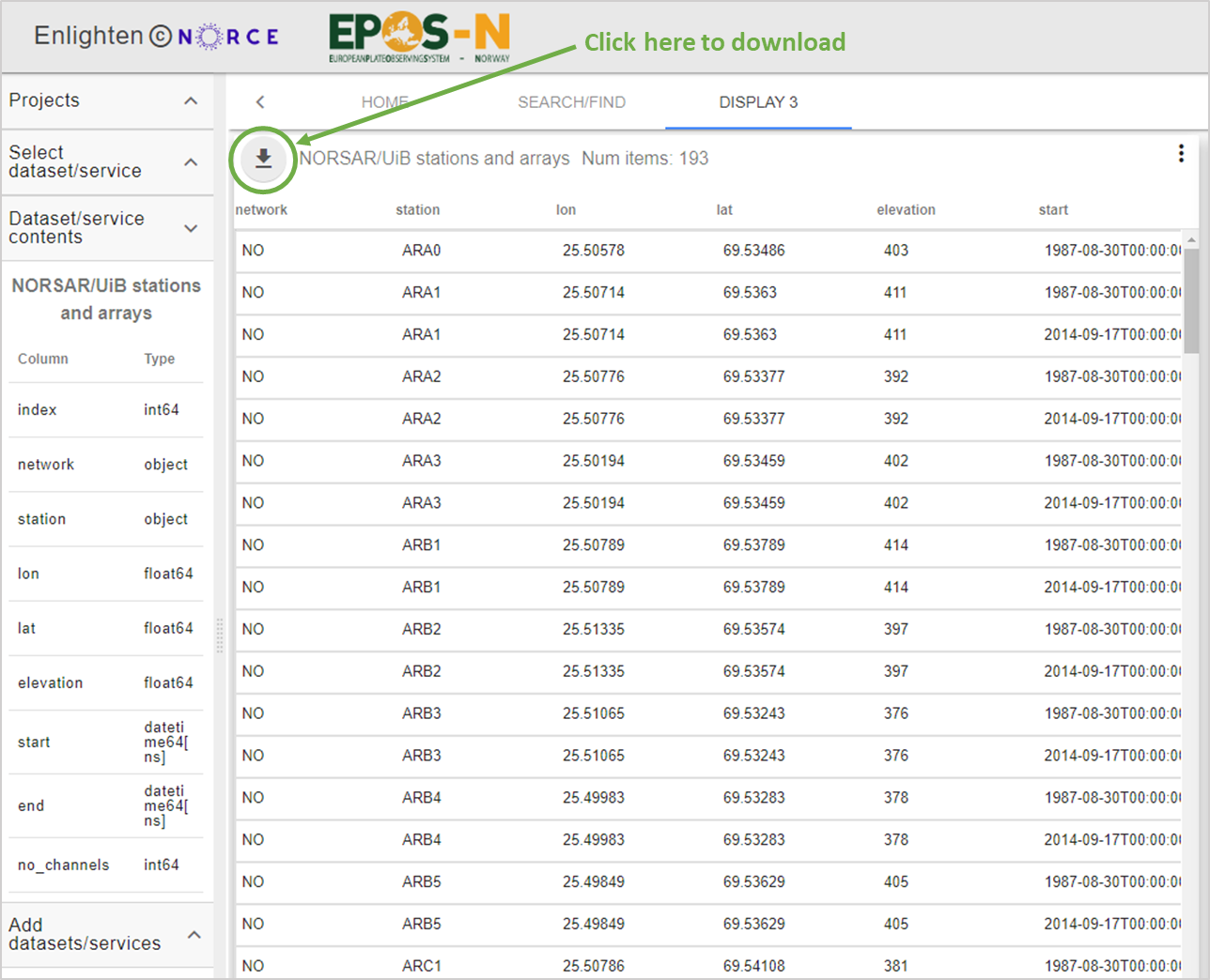
Figure 6.27 To download datasets, add the dataset to a table plot and click the download button.
By adding data from different datasets into the same plot, it is possible to compare them and do further analysis. This is useful if the user wishes to compare different data or datasets. Adding data with information about the same subject from different sources, for example earthquake data, can give a broader knowledge of earthquakes around the world. It is also an option to add data that contain information about other subjects, for example earthquake data and geophysical data. Figure 6.22 explains how to distinguish the different datasets with colour, which is useful when analysing.
7. References
International Federation of Digital Seismograph Networks, 2019. FDSN Web Service Specifications (Version 1.2), https://www.fdsn.org/webservices/FDSN-WS-Specifications-1.2.pdf.
Open Geospatial Consortium (2006). OpenGIS Web Map Server Implementation Specification (Version 1.3.0), www.portal.opengeospatial.org/files/?artifact_id=14416.
8. Example use cases
This appendix contains example use cases with instructions on how to solve them. The purpose of the example exercises is to give the user an idea on how the portal can be used. Detailed descriptions for how to use the common functions are not covered by the appendix. However, a brief suggested conclusion for the use cases are included.
8.1. Exercise 1
Where are earthquakes located in the Arctic region?
Procedure:
Load “Seismic events ARCTIC 1960-2016” (add longitude to X-axis, latitude to Y-axis and depth as colour attribute) in a globe plot and look at the seismicity. Load “Geophysical data” (add “Bathymetry NE Atlantic”), and “NPD factmaps” (add “Fault and boundaries”).
Look at the seismicity. The data shows all seismicity measured from the 60’s. This may seem overwhelming and it makes it difficult to see connections. To find out where the earthquakes are located, it is smart to limit the number of earthquakes by using brushing and linking.
Create a scatter plot and add time to X-axis and magnitude to Y-axis. By just showing earthquakes with magnitude over 3, it becomes easier to see the areas where earthquakes are located. Turn off “show points outside selection” for better visualisation.
Conclusion: Most of the earthquakes follows an axis through the arctic and continue towards the northern pole as illustrated in the globe plot (Figure 8.1). There is also some seismicity around Svalbard and Greenland (Figure 8.1). Earthquakes are mostly a consequence of plate movement, and that is why earthquakes occur along plate boundaries, in this case a mid ocean ridge. Earthquakes may also take place away from plate boundaries, but considerably less frequently, as illustrated in the plot.
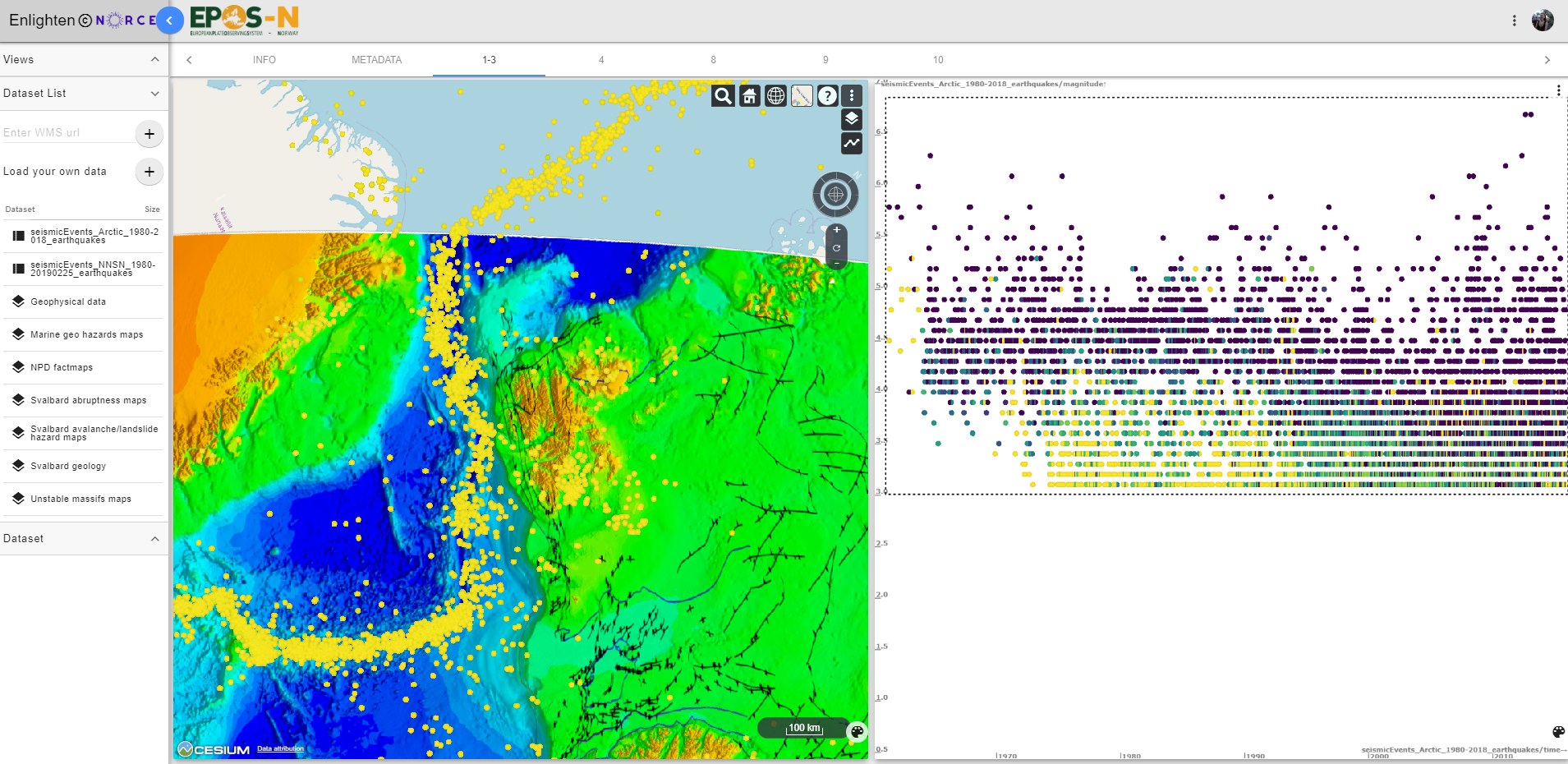
Figure 8.1 Display of “Seismic events ARCTIC 1960-2016” (longitude, latitude, depth), “Geophysical data” and “NPD factmaps” (left) and display of “Seismic events ARCTIC 1960-2016” with time and magnitude (right).
8.2. Exercise 2
How to see relations between seismicity, topography/bathymetry, fault locations and seismicity (focus on the Arctic region)?
Procedure:
Load the services; “Geophysical data” (add “Bathymetry NE Atlantic”), “NPD factmaps” (add “Fault and boundaries”), “Seismic events ARTIC 1960-2016” (add longitude to X-axis, latitude to Y-axis and depth as colour attribute) in a globe plot.
Conclusion: In the ocean the seismicity follows the contour of the mid-ocean ridge, which is a clear bathymetric feature (Figure 8.2). The relation between seismicity and bathymetry is caused by the same process, the construction of new oceanic crust and the divergent movement of plates away from the ridge, that forms the plate boundary. In and around Svalbard the earthquakes are located in Storfjorden and Nordaustlandet (Figure 8.2). The correlation between known faults and earthquakes is not evident, nor is the connection between earthquakes and topography in Svalbard.
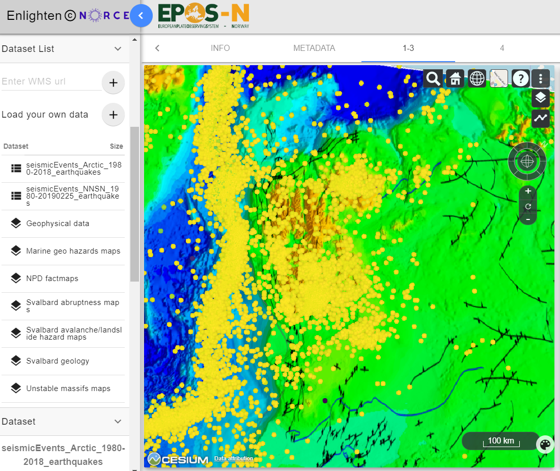
Figure 8.2 Display of “Seismic events ARCTIC 1960-2016” (longitude, latitude, depth), “Geophysical data” and “NPD factmaps”.
8.3. Exercise 3
Where are the largest earthquakes located (Arctic region)?
Procedure:
Load the services; “Geophysical data” (Bathymetry NE Atlantic), “NPD factmaps” (Fault and boundaries) and “Seismic events ARTIC 1960-2016” (add longitude to X-axis, latitude to Y-axis and depth as colour attribute) in a globe plot.
Create a scatter plot and add “Seismic events ARCTIC 1960-2016”. Plot time to the X-axis and magnitude to the Y-axis.
Use brushing and linking to highlight only large magnitude events. Turn off “show points outside selection” for better visualisation.
Conclusion: The largest earthquakes are located along the mid-ocean ridge (Figure 8.3). The mid-ocean ridge is located at a divergent plate boundary. The earthquakes with the highest magnitudes, most commonly occurs at plate boundaries because of the high differential movement velocity.
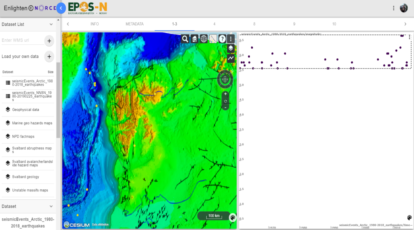
Figure 8.3 Display of “Seismic events ARCTIC 1960-2016” (longitude, latitude, depth), “Geophysical data” and “NPD factmaps” (left) and display of “Seismic events ARCTIC 1960-2016” with time and magnitude (right).
8.4. Exercise 4
How to see a relation between earthquakes, faults and structural elements?
Procedure:
Load “Seismic events NNSN 1980-2018” (add longitude to X-axis, latitude to Y-axis and depth as colour attribute), “Geophysical data” (add NE bathymetri) and “NPD factmaps” (add “Faults and boundaries”).
Create a scatter plot with “Seismic events NNSN 1980-2018” (time to X-axis, magnitude to Y-axis).
Use brushing and linking to exclude the smallest earthquakes. Turn off “show points outside selection” for better visualisation.
Conclusion: The plotted data shows a relation between earthquake occurrence and faults. Most of the earthquakes are located in the North Sea, where there is a large occurrence of faults (Figure 8.4). The graben systems outside the west coast of Norway may be causing some of the seismicity in the North Sea, if the faults are still active, of course. The earthquakes that are located in the northern parts of Norway occur predominantly along the shelf edge (Figure 8.4).
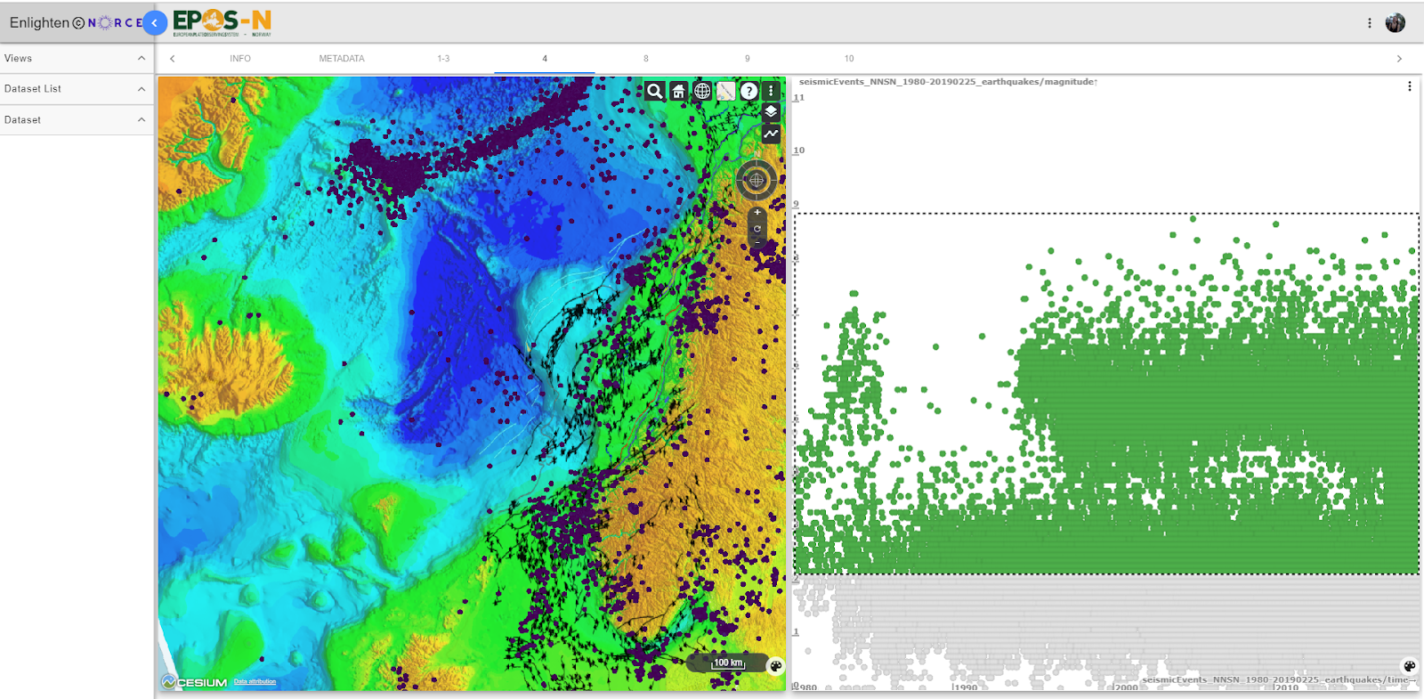
Figure 8.4 Display of “Seismic events NNSN 1980-2018” (longitude, latitude and depth) and “NPD factmaps” (left) and display of “Seismic events NNSN 1980-2018” with time and magnitude (right).
8.5. Exercise 5
Is there a difference in the locations of small, intermediate and large earthquakes? What does this tell us?
Procedure:
Load the dataset “Seismic events ARCTIC 1960-2016” and create a globe plot (add longitude to X-axis, latitude to Y-axis and depth as colour attribute).
Create a scatter plot with time to X-axis and magnitude to Y-axis.
Use “brushing & linking” along Y-axis to filter only small earthquakes, intermediate earthquakes and then large earthquakes. To clearly see differences between the type off earthquakes, it is helpful to only mark the smallest, and the largest etc. Turn off “show points outside selection” for better visualisation.
Conclusion: By filtering the different earthquake magnitudes (Figure 1.5), the distribution is:
0-1 magnitude: Mostly distributed at the mid-ocean ridge outside of Svalbard and in Storfjorden.
3-4.5 magnitude: Mainly at the mid-ocean ridge, but some in Storfjorden and Nordaustlandet.
5-6.5 magnitude: Primarily located at the mid-ocean ridge. Very few earthquakes with magnitude above 5.0 occur elsewhere.
The locations of the smallest earthquakes represent the coverage of the seismic network. Small earthquakes can only be detected by stations located nearby. This is the reason why the network only registered seismicity from the part of the ridge located closest to Svalbard and in the southern parts of Svalbard (Figure 8.5). Intermediate earthquakes can be detected by most of the stations. They occur mainly close to the plate boundary because of the high differential movement velocities (Figure 8.5). The earthquakes that occur in Storfjorden and in Nordaustlandet are caused by special circumstances (maybe one or two large earthquakes and aftershocks). The largest earthquakes only occur near plate boundaries (interplate), except for one earthquake in Storfjorden and one in Nordaustlandet (intraplate) (Figure 8.5).
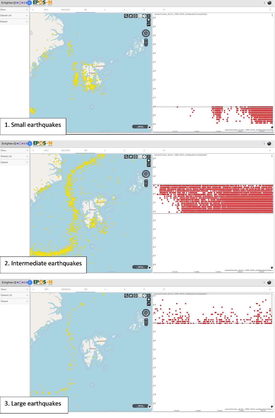
Figure 8.5 Display of “Seismic events ARCTIC 1960-2016” with longitude, latitude and depth in a globe plot (left) and display of “Seismic events ARCTIC 1960-2016” with time and magnitude (right).
8.6. Exercise 6
Is it possible to see any temporal patterns on seismicity at Svalbard? (the example focuses on Storfjord).
Procedure:
Load the dataset “Seismic events ARCTIC 1960-2016” and create a globe plot (add longitude to X-axis, latitude to Y-axis and depth as colour attribute).
Create a scatter plot with time to X-axis and magnitude to Y-axis.
Use “brushing & linking” along X-axis to filter time periods. Turn “show points outside selection” off for better visualisation.
Conclusion: The frequency of earthquakes in Storfjord increases with time (Figure 8.6). There was little to no seismic activity until 2000. In 2008 the seismicity increased drastically in the southern part of the fjord as a consequence of a large earthquake; Storfjorden Mw=6.1 earthquake, 21 February 2008 (Pirli et al., 2013). After a large intraplate earthquake, the aftershocks can last longer than with interplate earthquakes, which explains the increased seismicity in the area after the 6,1 Mw earthquake. The long sequence of complex aftershock, named Storfjord sequence, has led to over 2000 aftershocks (Tjåland, 2017).
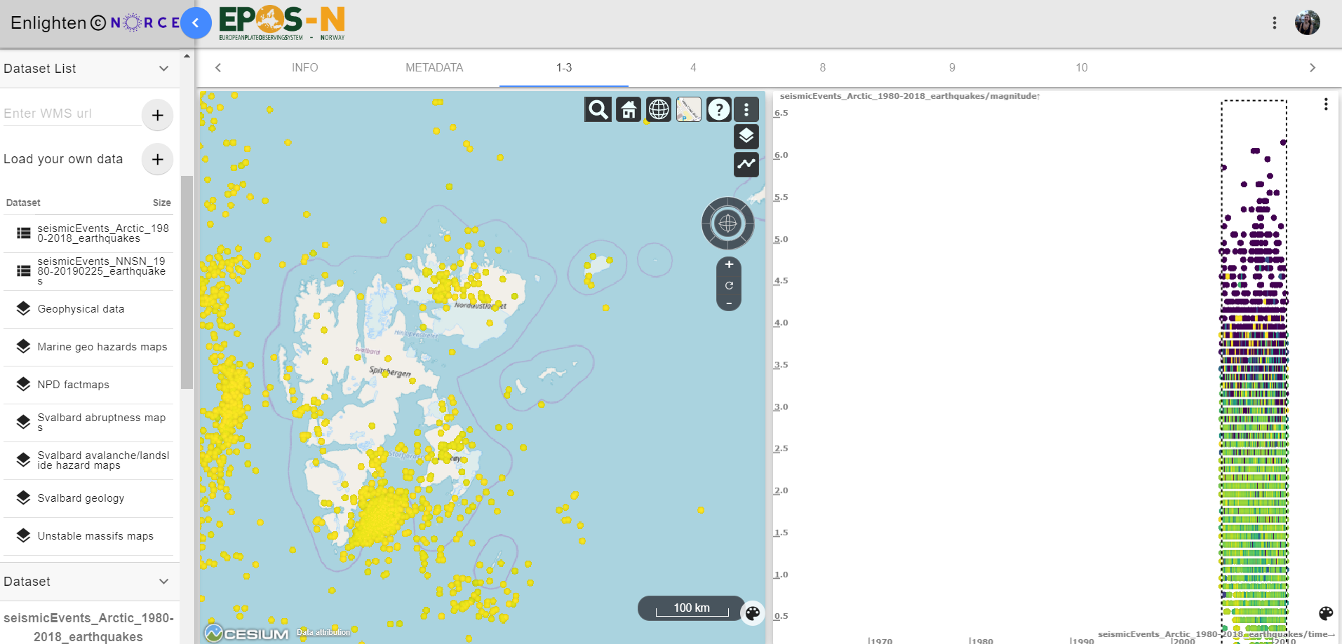
Figure 8.6 Display of “Seismic events ARCTIC 1960-2016” with longitude, latitude and depth in a globe plot (left) and display of “Seismic events ARCTIC 1960-2016” with time and magnitude (right).
8.7. Exercise 7
Is it possible to identify improvements in the monitoring capacity of the seismic networks over time?
Procedure:
Create a globe plot and load the dataset “Seismic events ARCTIC 1960-2016” (add longitude to X-axis, latitude to Y-axis and depth as colour attribute).
Create a scatter plot with time to X-axis and magnitude to Y-axis. Add colour coding by number of stations (nsta) to the scatter plot, and adjust colour scale (e.g. 0-20). In addition to this, add “NORSAR/UiB stations and arrays” to the same scatter plot (start to X-axis and no_channels to Y-axis.
Use “brushing & linking” in the globe plot to select a specific region.
Conclusion: There is clearly an improvement in the monitoring capacity of the seismic networks for small earthquakes over time. There is no improvement of the detection of large and intermediate earthquakes. Small earthquakes need to be located close to a station in order to be detected. Earthquakes with the largest magnitudes have been detected by all stations, while smaller earthquakes where only detected by a few stations or none at all until the 1990’s. After 2010, another improvement can be seen in the plot result (Figure 8.7). This implies that the seismic network has improved and that more stations have been installed in recent years, as can be seen in the plot (F:numref:fig1.7).
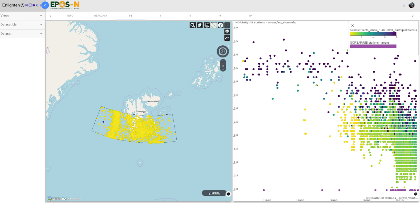
Figure 8.7 Display of “Seismic events ARCTIC 1960-2016” with longitude, latitude and number of stations in a globe plot (left) and display of “Seismic events ARCTIC 1960-2016” with time, magnitude and number of stations (right). Along the X-axis, the number of stations over time from “NORSAR/UiB stations and arrays” are plotted.
8.8. Exercise 8
Is there a correlation between topography/bathymetry/topographic slope and the locations of slope failures? (focus on Troms area)
Procedure:
Add the layer from service “Unstable massifs maps” called “Hovedpunkt – faregrad”. Add layer from service “Svalbard abruptness maps” called “Bratthet_jordskred”. After adding map layers, adjust the transparency for “Bratthet_jordskred” in globe plot for best results.
Conclusion: There is a correlation between slope failures, slopes and mountains. By looking at the plot, the risk for slope failure is normally located along mountain slopes with steepness of approximately 25-45% (Figure 8.8). Steepness in unstable mountain sides increases the risk of slope failures.
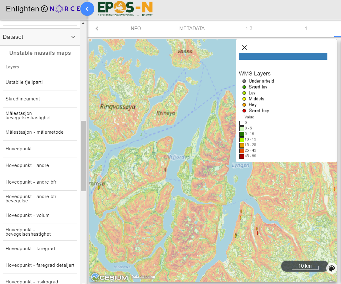
Figure 8.8 Display of “Unstable massifs maps” and “Svalbard abruptness maps”. Number values belong to “Bratthet_jordskred”. “Hovedpunkt – faregrad” is marked with circles on the map and in the legend.
8.9. Exercise 9
Is it possible to identify vulnerable infrastructure in areas prone to slope failures and/or earthquakes?
Procedure:
Add infrastructures from “NPD factmaps” called “Pipelines” in a globe plot. Add layer “Undersjøiske ras” from “Marine geohazards maps”.
Load “Seismic events NNSN 1980-2018” and add latitude to Y-axis, longitude to X-axis, magnitude as colour attribute.
Conclusion: Vulnerable infrastructures are located next to the Storegga slide (Figure 8.9). The pipelines in this area are placed by the edge of the landslide. The Storegga slide occurred around 8200 years ago. The megaslides in this region occurred repeatedly/regularly. Even though the intervals are roughly about 100 ky, the infrastructure in this area is vulnerable (Bryn et al., 2005). There is a lot of seismic activity along the Norwegian west coast and in the north of Norway (Figure 8.9). Some of the pipelines are crossing or located near known slope failures. Combined with seismicity, this may trigger slope failure, which may affect the infrastructure.
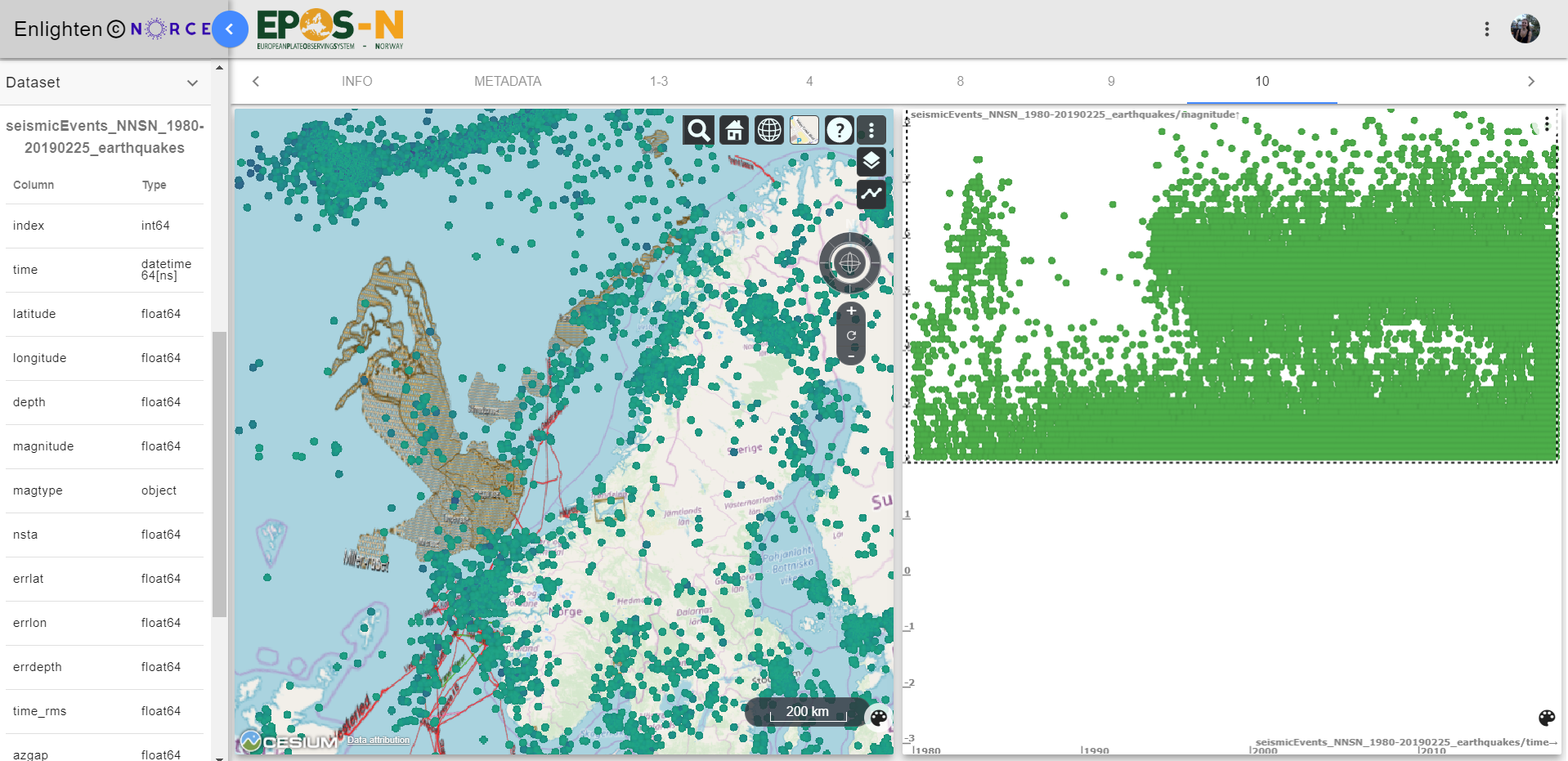
Figure 8.9 Display of “Seismic events NNSN 1980-2018” (longitude, latitude and depth), “NPD factmaps” and “Marine geohazards maps” (right), and display of “Seismic events NNSN 1980-2018” with time and magnitude (left).
8.10. Exercise 10
What can variations in GNSS velocities in Norway indicate?
Procedure:
1. “Load GNSS velocity maps” and create a globe plot. Add longitude to x-axis, latitude to y-axis height to colour attribute, east to vector-x, north to vector-y and height to vector-z. To add vectors, click “Vector plot” in the toolbar.
Conclusion: The vectors show a systematic change in colour from the west coast of Norway towards Sweden (Figure 8.10). Vectors can indicate both plate movement direction horizontally and vertically. The colour change indicates a change in height (mm/year), which means that the plate moves quicker vertically near the Swedish boarder, than by the coast. The vertical movement is largely due to isostatic uplift. The isostatic uplift will be larger away from the coast, where the large ice sheets were thickest.
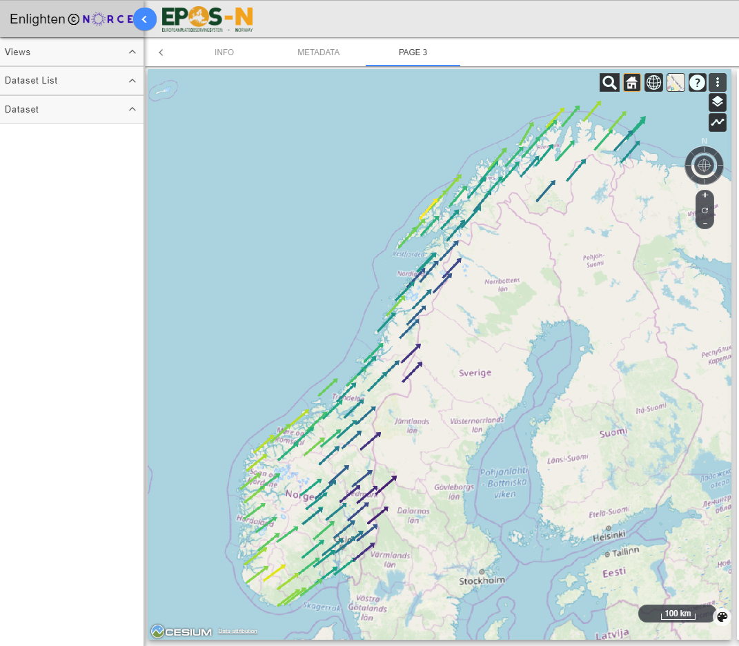
Figure 8.10 Display of “GNSS velocity maps” (longitude to x-axis, latitude to y-axis height to colour attribute, east to vector-x, north to vector-y and height to vector-z).
References
Bryn, P., Berg, K., Forsberg, C. F., Solheim, A., & Kvalstad, T. J. (2005). Explaining the Storegga Slide. /Marine and Petroleum Geology/, /22/(1-2 SPEC. ISS.), 11–19. https://doi.org/10.1016/j.marpetgeo.2004.12.003
Pirli, M., Schweitzer, J., & Paulsen, B. (2013). The Storfjorden, Svalbard, 2008-2012 aftershock sequence: Seismotectonics in a polar environment. /Tectonophysics/, /601/, 192–205. https://doi.org/10.1016/j.tecto.2013.05.010
Tjåland, N. (2017). /Double-Difference Relocation and Empirical Green’s Function Analysis of Storfjorden Earthquakes. Master thesis, Department of Earth Science, University of Bergen.